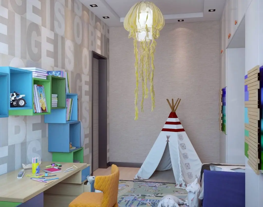
Project in Montreal Residential Complex
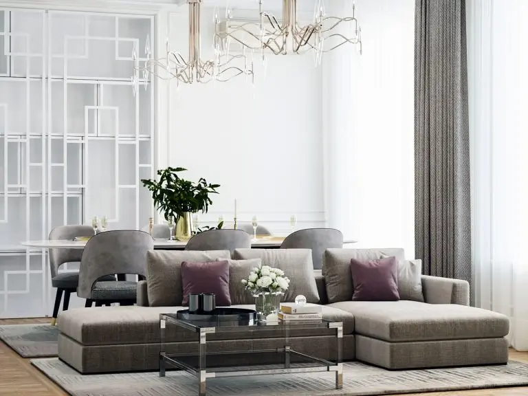
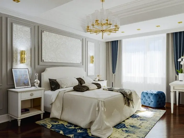
This interior in Monreal RC is well suited for connoisseurs of traditional yet relevant solutions. Those who think that a classic interior is boring and dated are mistaken. In a modern interpretation, this style takes on a new breath of life and looks very fresh.
The very first thing a designer starts with is a floor plan (after taking room measurements, naturally). On the plan, we mark all load-bearing elements (columns, walls, window and door openings, air ducts, etc.). It is essential to indicate all utility connection points and various meters (gas, water). Afterwards, we discuss ideas and preferences with the client.
One of the clients' key requests was to design the interior in soothing tones, but with a unique touch. Our clients were a couple with two children. The apartment area is 97 m²
REDEVELOPMENT. CHILDREN'S ROOM
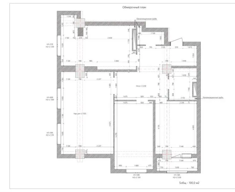
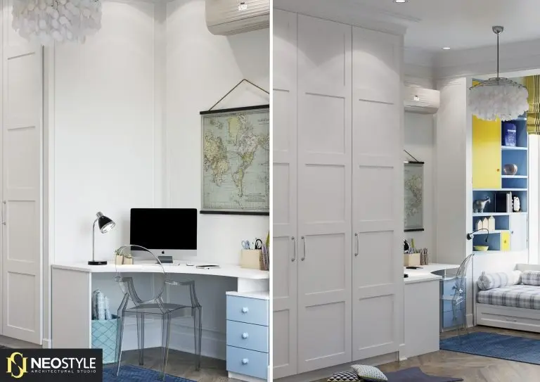
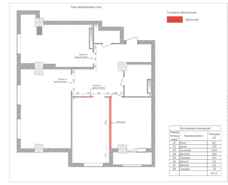
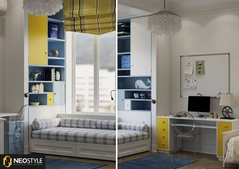
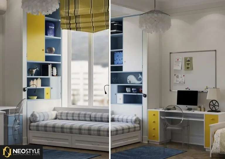
Let's take a closer look at the children's room, as it was specifically for this space that we undertook the main wall demolition and doorway widening. (Fig. 2)
When designing the children's room, our team was tasked with planning a space for two children of different genders. The first challenge was the very compact space; the second was the necessity of creating full-fledged, separate functional zones for both the boy and the girl. (Fig. 3)
I think we succeeded. It was proposed to remove the wall between the kitchen and the parents' bedroom and construct a drywall structure with a niche to accommodate built-in wardrobes for both rooms. Thanks to this move, we didn't lose a single meter for storage, thereby creating all the functional zones for both children.
A neutral color palette was chosen — yellow and blue. Bright and fresh, suitable for any age. The design was approved by both the room's owners and their mother.
HALL
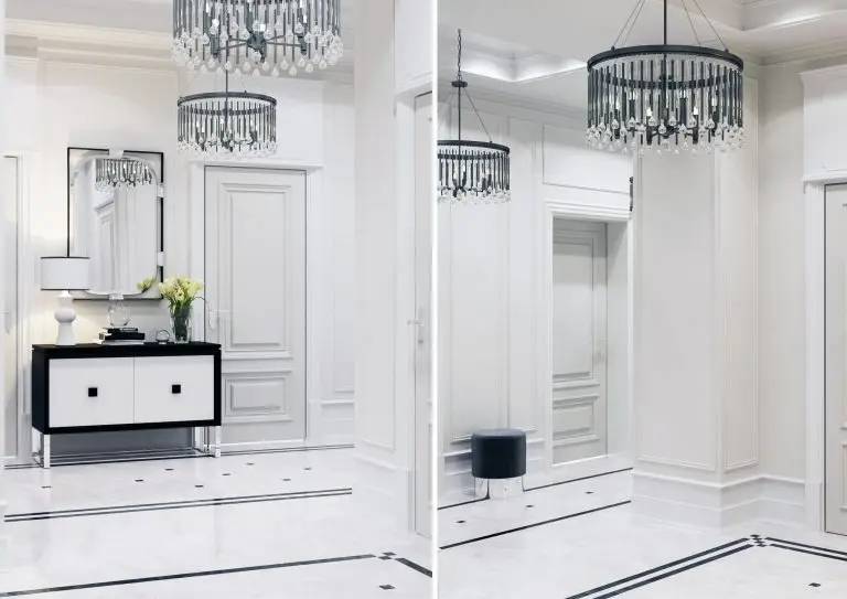
Hallway. The flooring in the hallway and kitchen is laid with ceramic tiles from the Grand Stone showroom, by the Cerama Marrazzi brand. A distinctive feature is the layout pattern, which is unified across both areas — meaning there are no transitions or cutoffs. It looks stunning, like a single marble carpet. There are, however, some drawbacks: 1. requires the work of an experienced craftsman 2. Increases material consumption. (Fig. 4)
We would also like to mention the ceiling height separately — in this apartment, the height is remarkable at 3 m 20 cm. Just the way we like it! And we really wanted to accentuate this airiness and grandeur! That's why we suggested that the clients embellish the doorway with transoms like these. This both highlights the interior doors, turning them into art objects, and emphasizes the ceiling height. (Fig. 5)
KITCHEN
Moving on to the kitchen. The kitchen space is designed according to all the principles of classic aesthetics. The architectural design of the cooking zone undoubtedly catches the eye right away — elegantly turned balusters complemented by vertical fluting. The same elements were used to create a small island. (Fig. 6)
Not everyone likes upper mezzanine cabinets in a kitchen, considering them barely functional... But here, the mezzanine served as a handsome facade concealing the gas pipe. According to regulations, gas utility lines must always remain easily accessible, so you only need to open the uppermost cabinet. Besides, such mezzanine cabinets are convenient for storing rarely used tableware. (Fig. 7)